

Organizations around the world are just beginning to grapple with data and further analysis. With further development in the Internet of Things (IoT) space, organizations are dealing with more data from a multitude of devices. It has become increasingly necessary to access data visualization tools to decipher all of this information in a simple format.
Data visualization allows for a visual representation of the firm’s data taken from its repository. It creates a brief synopsis of data in graphic form. This is so that the user can quickly digest it. They can then proceed to decision-making based on the glimpse into their data. With this technology, various firms have been able to make data accessible and facilitate a sense of clarity.
With the introduction of intelligent software, organizations can break apart and analyze data from within their respective data repository. This technology will enable users to segregate data in multiple dimensions and granularities.
No programming is required to derive these insights. Users will interact with their data in a visual, analytical, and exploratory experience directly on Hadoop. The product will allow businesses to make more informed decision- making.

Data Visualization may appear in a clear, concise, and easy format to understand. But it is not so simple to produce. These programs must be maintained and managed by someone who is familiar with the programming.
Intelligent Analytics can provide data visualization with a direction and purpose. Combining data with processing speed, storage of information, and analytics will make an organization’s services flow.
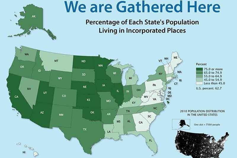
In a popular form of data visualization, it may appear from a country that hopes to display census results. This would allow their collected data to be made accessible and understood by the general public.
For example, the US Census Bureau holds a Data Visualization Gallery. As stated on the website, the visualizations provided will mainly pertain to historical population data. In upcoming visualizations it is proposed that they will have graphics covering all topics and areas.
The Department of Statistics in Singapore is an entire agency that provides a log of data visualization to Singaporeans. This has been created based on the ‘latest key indicators’, or main topics of social and economic development, that are analyzed through data collection.
It has become increasingly important for organizations, government and business to embrace data visualization. It allows for difficult concepts to be easily digested and interpreted by the masses, in the case of census data visualization. Moving forward in a world monopolized by big data, organizations should make an effort to embrace data visualization.